Your Cart is Empty
Women's Shirts 40% Off Through May 11. Discount Applied at Checkout. Always Free Shipping.

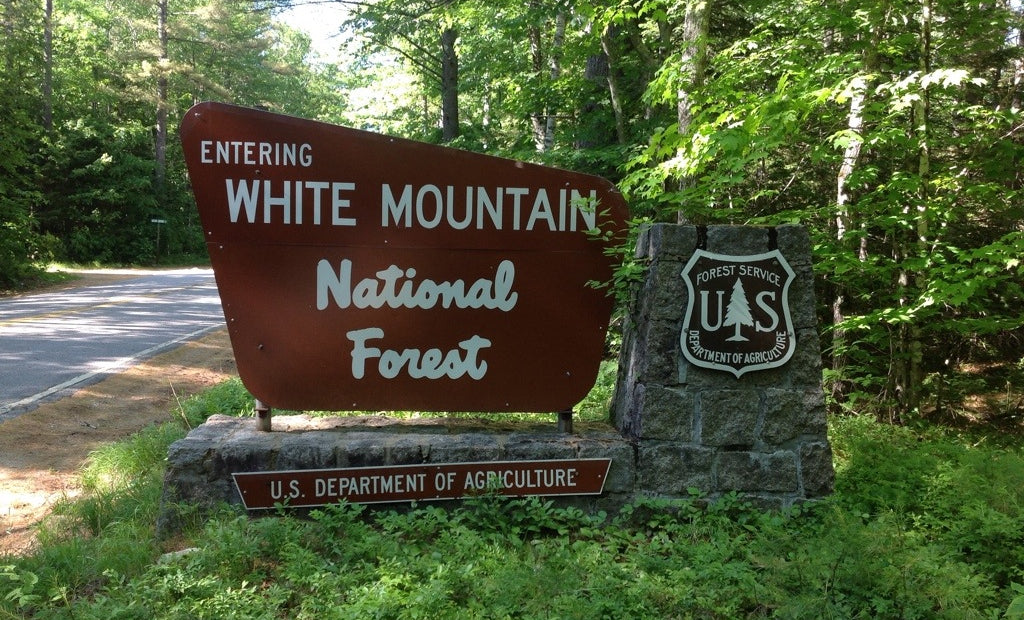
Whether you drive, camp, fish, or hike in one the 154 National Forests in the U.S. this summer, your journey will be bookmarked by a retro logotype in cream floating atop the chocolate background of a National Forest sign.

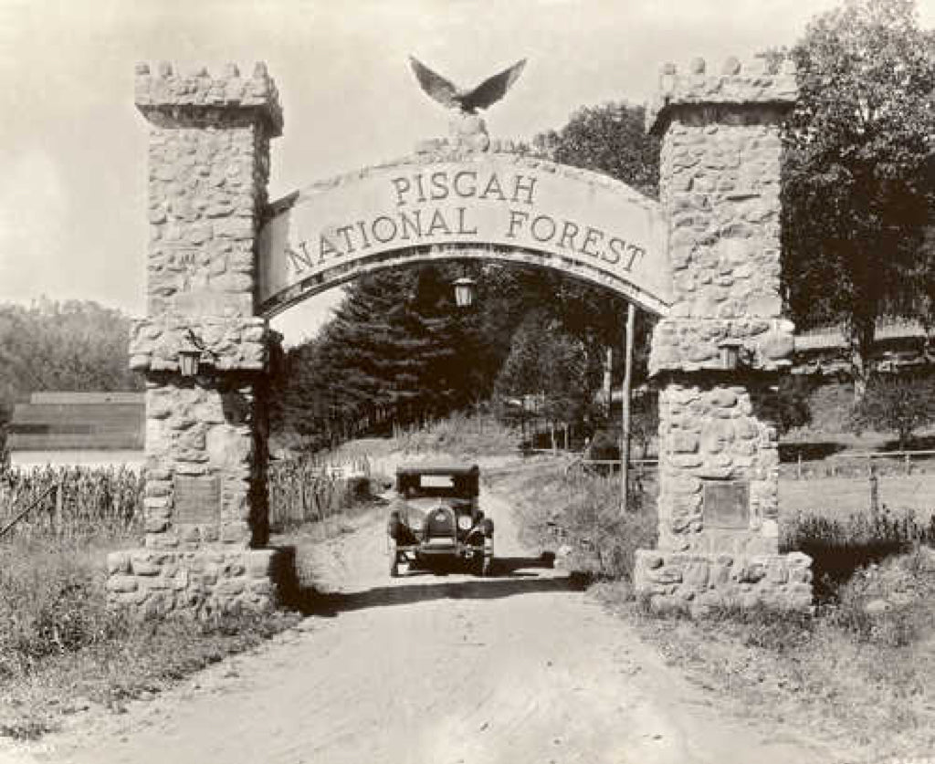
This wasn't always the case, of course, and in the early days of the national forest program tourists were welcomed with a dizzying variety (and quality) of signage. It wasn't until 1961 that the Forest Service finally conducted a project to review and modernize the program's visual identity, a project that they assigned to Virgil R. “Bus” Carrell.
Bus conducted a study of signs throughout the U.S. (sounds like he took an epic road trip!) and returned to sum up his findings with a practical philosophy of signage:
"If the sign has an understandable purpose, is properly designed, made, and appealing to sight and emotion, it adds to the security, understanding, and pleasure of the tourist."

Well, Bus, on behalf of generations of American parks enthusiasts, we think you nailed it! And we know we're not the only ones who think so, as, more than half a century later, this iconic design is still going strong.
What makes them work? The beauty of these signs is how they manage to feel timeless while being strongly influenced by the era in which they were crated. The slanted, rounded trapezoid of the sign pays homage to the “modern” feel of the 1960s, a shape could easily be found in the background of a Jetsons cartoon. The font has a happy-go-lucky feel synonymous with the booming decades of the mid-century American prosperity. Yet for all of their mid-century progressive design roots, these signs feel strangely at home in the forest. They are serious and uniform while simultaneously inviting; a wonderful translation in design that welcomes visitors to explore, learn, and be inspired by the forest while respecting its beauty.